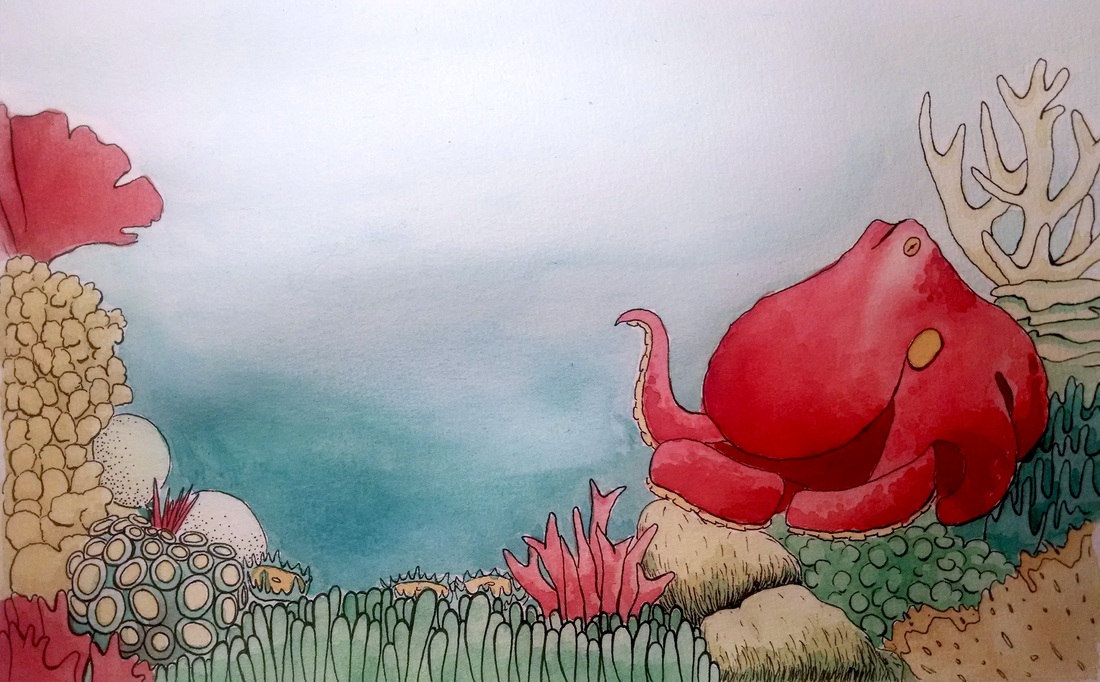
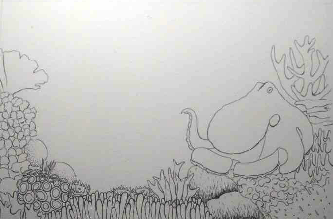
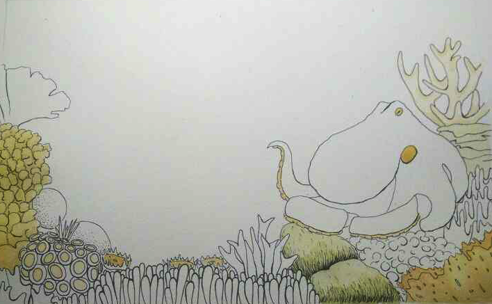
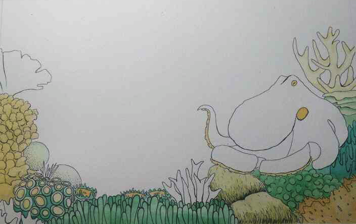
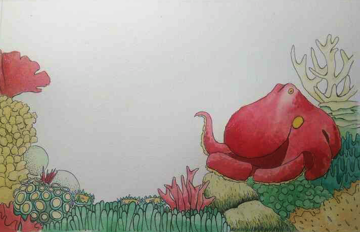
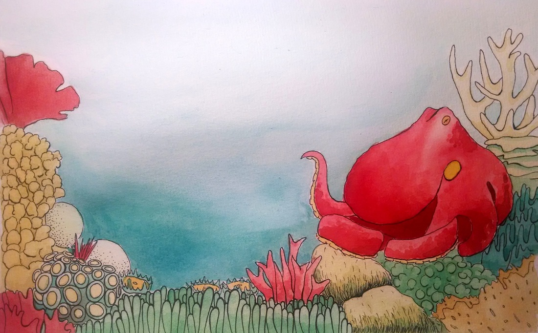
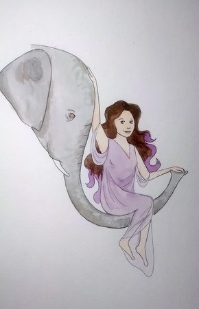
I showed my postcard image to my friend, and he suggested that before I put color down I do some ink washes with black ink first. That would certainly add some much needed shadows in other sections. What do you think dear reader? Don't care how you tell me, be it weebly comment, facebook or email. Here's the image again. I'll try and put a higher quality image up with the final edits later, this is still just a camera pic...
0 Comments
I wouldn't say it's exactly water color, but the use of dark and light while still maintaining a color palette in this comic is spot on. Link to the rest of the comic as well as other great comics (I'm slowly working my way through them at the moment is here. From The Heart of the Matter, story by Josh Tierney, Art by Rachel S. (Baru) at spera-comic.com.
Sometime over the past few weeks I have gotten over my anxiety of drawing hands.
Hallelujah. It's about ruddy time. Feet, you're next. For the IP exhibit, we have to make a postcard for...actually, I'm not quite sure what its purpose is. I guess it's like a save-the-date sort of invite that you hand out to people to remind them to come see the thing you killed yourself for. Whatever the reason, us students have to come up with an image for the front. Since my pages aren't colored yet and I didn't want to color a page ahead of time (I want to keep my colors as consistent as possible, and it will be easier to make it all cohesive if I do the coloring in a chunk), I made another image specifically for the postcard. Also, I wanted something with a coral reef and an octopus for my postcard. Just because. So! Here are some process pics! Apologies for the crappy quality, I was using a new app for camera work and it was a poor life choice. Step 1: Ink it all up. Step 2: Yellow layer. Step 3: Blue-green layer. Step 4: Red layer. Step 5: Add water (see bottom) Step 6: Add finishing touches. I'm pretty happy with how it all turned out, and it's been SO nice to watercolor something. So psyched to get to that portion of production. And here's the final product (minus some more ink detail that I'm adding later)! I think I'm going to spend today inking some pages I already sketched, it's been so hard to motivate myself to sketch lately...
Some updates that don't necessarily pertain to IP, but are relevant nonetheless. First of all, I'm starting an independent study with seth ellis where I will be exploring comic form! Woo-hoo! MORE COMICS. Because obviously I don't have enough in my life already. If you want to follow that project, head over to this link. Second of all, look at this awesome opportunity I saw on the internet! Some of my favorite lady cartoonists have contributed to this over the years. I'm going to pull something together for it for practice and experience and whatnot and submit it! Plus, I think the story of how I got into comics is sort of hilarious. But maybe that's just me.
And last of all a little bit of publicity plug. I work as a part-time cartoonist for a blog called Secret Zen Garden, and I would love the random people who read this stuff to go on over there and give it a looksy. A lot of health facts and how-tos, and I have a serial going called "Crazy Aunt B" that is occasionally funny. That's all for now. Updates on the morrow on page progress. Away! The colors for this are much better in person, but I did what I could to make it work on the screen.
This is a watercolor test I worked on yesterday and today, and there was good and bad with it. The good was the panels on the right. I wanted to be able to hammer down some underwater color gradations that looked more natural than what I've done in the past, and I think I came close enough that I can stop stressing out about it for the time being. The bad was the panels on the left. The sky on the left is shit. I keep trying to do a night sky and it just doesn't work. I'm also having problems making colors as vibrant as I want them to be. I'll probably have to do some more trial and error. Maybe I'll put down a gray layer of water color and then put a black layer underneath it on photoshop. Because getting pure pure black without ruing what else is in my scene is going to be tricky. I think I'll try and do more tests like this in weeks to come. Plus, it's making me so damn excited to color my pages. I don't know what my favorite part of making comics is, but coloring is definitely up there. I'll have more watercolors up this weekend, I'll be working on my postcard image for the IP show. Until then, as always, as was this morning and last night and the night before that....I'l I'm going to postulate a hypothetical at you.
Have you ever been in a math class (yes I'm using math as an example, save your criticism for after) and had to deal with some tricky concept? And you've attacked it from all sides and tried to make sense of this huge knot in your brain, and it still is confusing? Then someone says something and POW! It all makes sense. Boom. How could you not see the answer before, the answer was right there. All the pieces and parts make sense and you feel like you've climbed an intellectual version of Everest. That is what is happening right now reading these books. Right now I'm reading the one on providing backgrounds and it's already helping. I know that I have a ways to go before I've learned all I can from these books but I'm so psyched to apply all my new learnings to my comic. I'm considering finishing up the pages that I have and fixing some perspective mistakes I have in some panels, coloring the whole schmeal, and then going back with some tracing paper to add some more line work. Ugh. These books. These books are making this comic exciting for me to work on again. These books are saving my life. Might have another post tonight with some watercolor tests I did early, until then, I'm working on pages. Someone (bloody hell if I know who) sent me comics. Well, not really comics. But books about comics. I came home from class today and saw an amazon box which I thought was a textbook I ordered. I was confused because it was all wrapped up in amazon prime tape, which I don't have, but I thought it was a promotion or something BUT IT WASN'T IT WAS BOOKS. After I opened the box I think I just stared for a good minute because I was expecting to see "Environment and Society: A Critical Introduction". The books are as follows:
These are the first comic instruction books I have ever owned, other than one maybe written my Jim Davis in the 90's that I shouldn't even have mentioned. And they are perfect! I'm not a superhero person but I draw people and they are perfect perfect perfect!! And "Set the Action!" is all about doing background which I am absolute crap at and was going to work on tonight and I am in such bliss. There was one other book, Locke & Key: Clockworks, Volume 5 by Joe Hill and Gabriel Rodriguez. I've never heard of it. I think. Something in my mind is telling me that I have, but I can't remember. Maybe it's a clue as to who sent it? Strange to send a fifth volume of something.
Anyway, I'm hugely excited and can't wait to sit down and give these a read. If you are out there strange and wonderful comic giving fairy, I thank you from the bottom of my heart. You combined my love of books and my love of comics into one sublime and perfect present. As I have no clue who you are, I will try and pay you back by learning as much as I can from these books. Thank you thank you thank you. I can't say it enough. Took a brief pause from pages today to test some new fonts. I did a couple, but these two are the ones I ended up liking the most. I think I'll end up using some version of the top one, because I think the neatness will work well with my style of drawing. But I installed the second font as well because I like it.
I also want to do some sort of specialized font for my villain, but that requires more thinking yet. Back to pages. |